Sunday, September 26, 2010
Thursday, September 16, 2010
Wednesday, September 15, 2010
Project One Essay
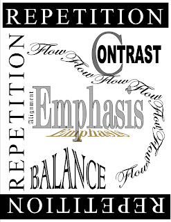
In my Project One, the design principles: Emphasis, Contrast, Balance, Alignment, Repetition and Flow is designed on my page following the rules of 3rd. I believe this page to be an eye-catching design which starts with Emphasis placed as the hierarchy of the page with a shadow of itself. Repetition is in a full reverse on the top and bottom of the page and printed in black on the left side of the page. Contrast place on the right side of a page below reputation, the C in contrast is a 150 pixel font size and the rest of the word is 60 pixel font size. Balance is designed so that the A and the center of Balance comes to a point in slants down on the left and right side of the world. Alignment is placed alongside the outer edge of Emphasis. And we conclude with Flow in a circular motion. I believe this piece to be very eye-catching and interesting to look at.
Saturday, September 11, 2010
Wednesday, September 8, 2010
Subscribe to:
Posts (Atom)


